
Design Project- Brainstorming and Planning UPDATED

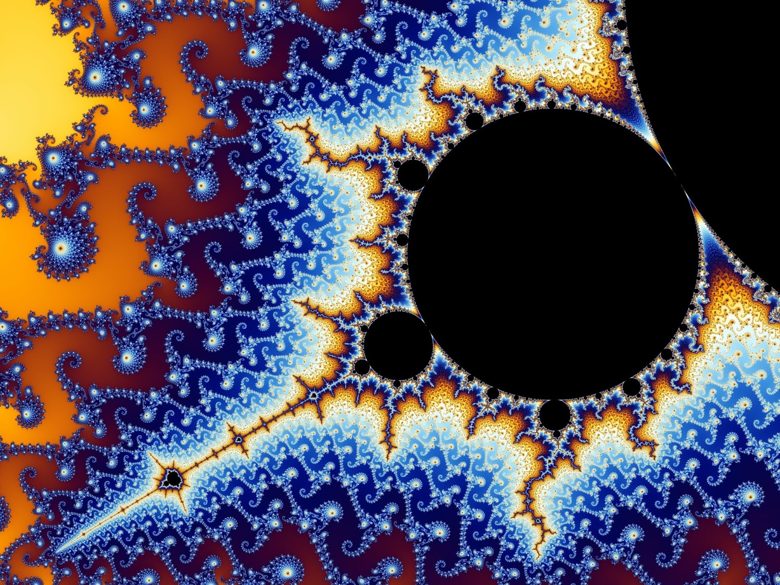
Inspirational Images (Fractals):


Proposal: Use photoshop to make a fractal-like patterned image, but also use symmetry and colour.
I was inspired by designer John Maeda, a few of his designs in particular:


Planning:

Simulating a "fractal" in Photoshop:
Tutorial: https://design.tutsplus.com/tutorials/how-to-simulate-fractals-in-photoshop--psd-340
(Rating: 6.5/10, because it is slightly outdated)
*Taking it my own direction, using tutorial as a loose guide

-Other tutorials existed, but were very confusing and didn't appear helpful

Difficulty for me: 7/10 (Because I'm not good at this kind of stuff)

It isn't a proper fractal technique- that would involve math. (It turned into a pattern, pretty much.)

Notes for me:

*Background colour: go to create new fill or adjustment layer in layer menu bottom center

First circle: Layer-layer style to get to options for circle
 -Gradient overlay: half and half option (redgreen)

To merge layers: make all layers you want merged visible and others not, right click on one, merge visible

To adjust colour of object: Image menu, adjustments, hue/saturation

To send to back/bring to front: Image menu, arrange

To flip an object: Edit, transform

Colours used: (hue and saturation from original teal colour, 6adec4)

Blue: +34

Purple: 
        +115
        -10
        +9
Yellow:
       -112
       -12
       +23 
(add saturation +46)
Red: 
    -170
    +10
    -12
Orange:
       -150
Pink:
     +142
     +10
     +20
Green: 
       -43


Comments

Popular posts from this blog

Final logo Design and Critique

My logo reflects the subtler and more mature side of my personality. I used a simple font and mainly black and white, using simple shapes to frame the initials. Turquoise is my favourite colour, so I knew I had to include it somehow in my logo. I have taken out a few confusing elements from my original logo ideas, though I kept the overlapping initials because the shape they make is interesting but still simple.

TED talk-Rory Sutherland

10 things: -Rather than changing reality, you can change people's perception in order to solve problems. -The placebo effect happens when you believe something, such as medicine, is helping you, when it really isn't. Because you're deceived into thinking it works, it has the same/similar effect as actually receiving the thing that is meant to help you. -The train problem: saving money and making the experience on the train ride better, rather than spending more money and getting a completely new track system to make the journey faster. -Relative prices (Orange juice scam, more expensive price written in English, cheaper in Spanish, for the same item). -"...All value is subjective... persuasion is often better than compulsion." -"In Italy, penalty points (for speeding) go backwards. You start with 12 and they take them away. Because they found that loss aversion is a more powerful influence on people's behavior." -Symbolic v...

Fractal-Turned-Pattern Progress

January 18th -More adjustments -More pink, all turquoise gone January 17th -Changed green colour -Added more colour and touched up swirls January 16th/17th -Added more swirls and colours, adjusted sizes January 11th/12th/15th -Added more swirl shapes using ctrl-shift-t -Started adding colours (image-adjustments-hue and saturation) January 10th -Copied shape 3 times, put a shape in each corner (flipped using edit-transform-flip vertically/horizontally) -Started brainstorming what pattern to do January 9th -Copied merged 4 circle shape once (ctrl-shift-t) -Resized copy slightly smaller and on more of a angle (tilt more for closed swirl, less for open swirl) -Used ctrl-shift-alt-t shortcut multiple (40 or more) times to create a swirl January 8th -Added 3 slightly smaller circles tilted on an angle to original circle (used "ctrl shift t" keyboard shortcut, resized circles and placed...